
Hello and welcome to the How To Use Elementor series! In the first of this series, we’ll be going over how to create headers in Elementor; what they are, why they’re important and how to think outside the box when utilizing them in your web building project. This series will assume you have a fresh installation of WordPress ready for development, as well as Elementor installed, so if you are looking for any advice along those lines, sound off in the comments and I’ll be happy to put it in the queue for a future tutorial series.
In this series, I’ll be going over various elements of web construction specifically using Elementor so that you can have a flexible, scalable and beautiful website. I’m a huge fan of Elementor and have been using it for over 2 years now. Having built several dozen websites in my time, using a variety of themes and page builders, I can honestly say that Elementor has been one of the most flexible and well thought out web building solutions I’ve ever worked with. It’s an absolute pleasure to share my knowledge with those who are ready to jump into the mix and get their hands dirty building their own website. Let’s get to it.
What is a “Header” in Elementor?

The idea of a header is pretty simple, so I won’t spend too much time on what it is. The only reason I’m even touching on this aspect is because the word “header” can mean a couple of different things, depending on who you’re talking to. I often work with marketing firms to build websites for their clients, and the term “header” is usually used, by those who don’t build websites, to refer to anything above the fold on the page in question. For instance, on a home page with a hero image setup like what you see here, the “header” could refer to the entirety of this image, including the background hero image, the messaging, the call to action, the imagery and the logo and navigation area. For me personally, I don’t agree with this assessment, and it appears that Elementor doesn’t either.
In this screenshot, take note of the blue outline at the very top of the page. When you create a header using Elementor, this is the default location for this section, and in this example, I have already added the logo on the left, and the menu icon on the right, but on your initial attempt, it will be an empty space, likely preceded by an option to import a ready made header example. This is what a “Header” is in Elementor, and it is specifically meant to house the logo and the navigation bar, and perhaps even a phone number and email. One of the reasons I love Elementor is because of the flexibility of the builder, as even with headers, it has the same anatomy as any other section you would make in the website. The only real difference is that the section for a header is automatically set to position itself at the top of the viewport, much like a section for a footer is set to position itself to the bottom of a viewport.
How to create a “Header” in Elementor
Once logged into WordPress, you will navigate, via the left sidebar, to Templates > Theme Builder.
Once selected, you’ll find a page that houses all of the various builder templates you will make. Notice the “Add New” button towards the top of the page, and select it.
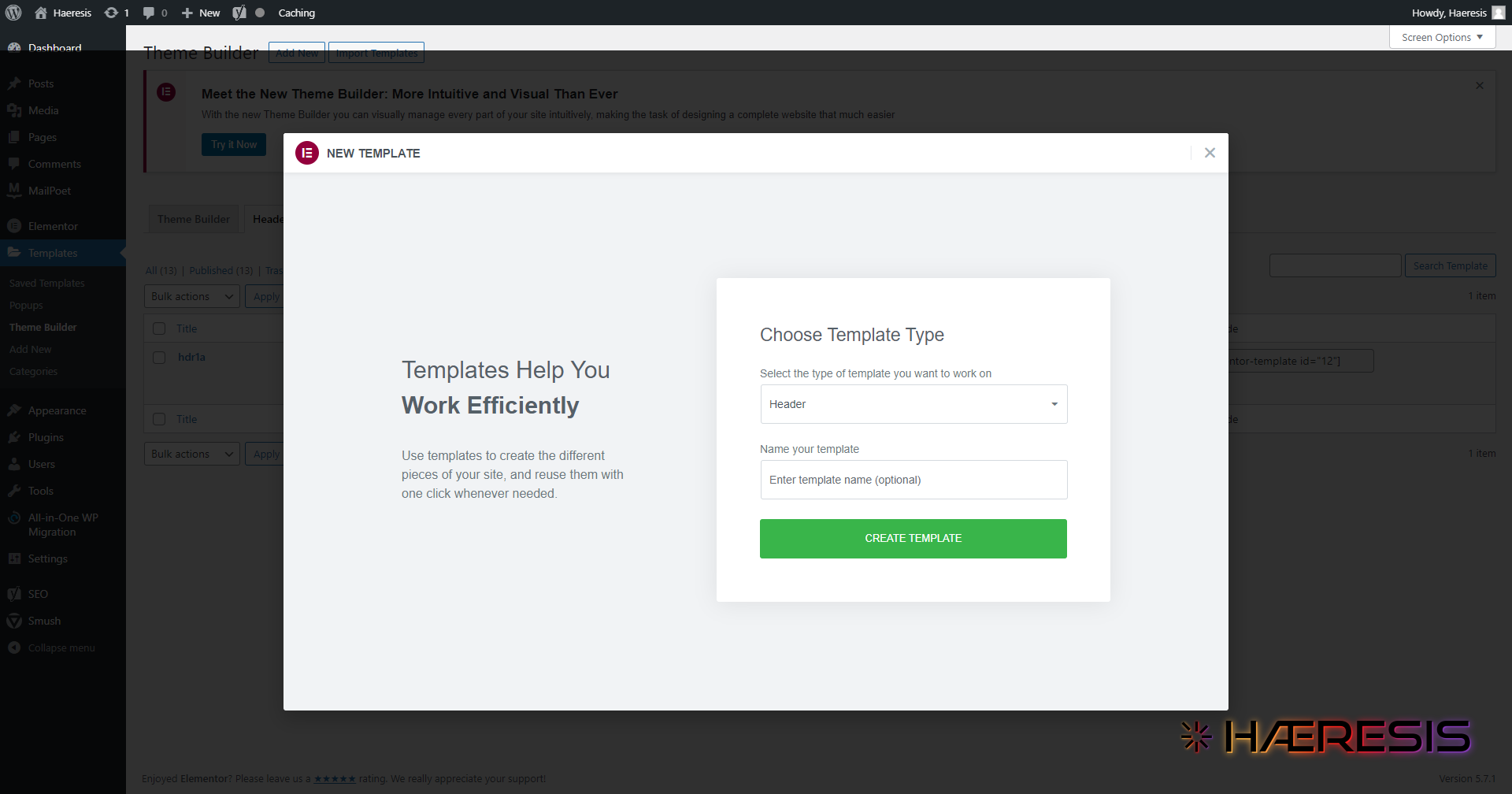
From there, a dialogue box will open that allows you to confirm your choice by selecting a Header type template, and also name it, as you can have multiple headers in a single website.
Once you have selected Create Template, you will be taken to a new page where you can begin constructing your header. Initially, you will see a Elementor Library lightbox, that is preset to show Header blocks that are available to import. These are mostly available to those who have invested in the pro license for Elementor, but rest assured, with enough patience and time, you can create any one of them by hand. These are mostly just extremely helpful shortcuts to get the ball rolling.
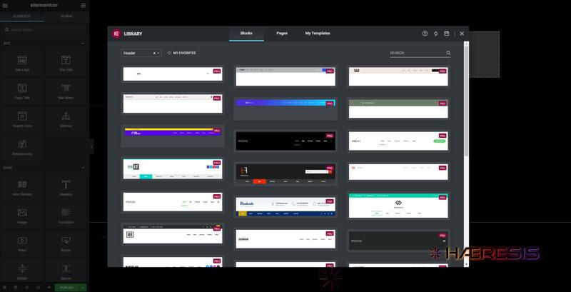
If you feel so inclined, select a header from the library that fits your desires and follow the prompts to import it. If you do choose to go this route, a helpful tip to consider is to stay away from headers that implement a selection of social media icons in the top right corner. This isn’t exactly gospel or anything, but the widely accepted idea is that you don’t want to give your visitors any reasons to leave your page, so social media icons are best left to below the fold, or the footer. Consider perhaps exchanging the social media icons for an email address or phone number, or maybe a concise keyword phrase for added boon to organic SEO efforts.
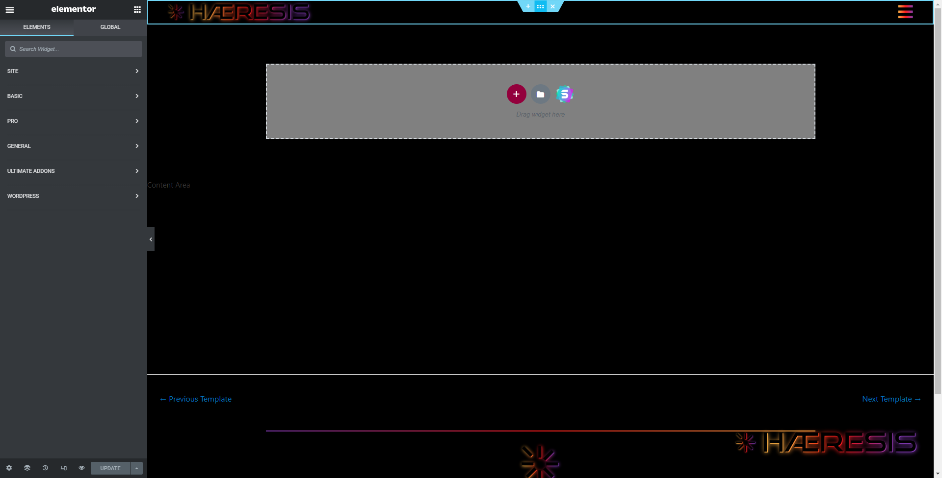
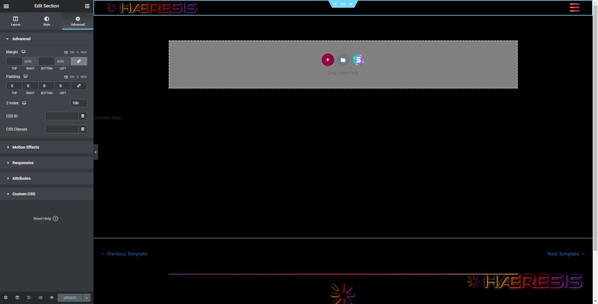
If you’re going to make the header from scratch, then you’ll start the process by closing out the library lightbox using the X in the top right corner. This will leave you with the default view of a fresh Elementor page, ready to be built.
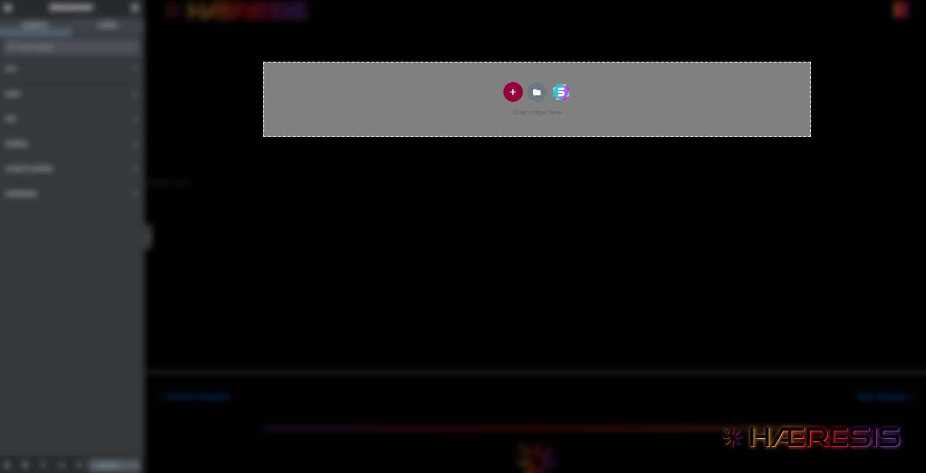
In the example above, you’ll notice three icons in the dotted line area. The “S” is an icon you probably won’t see, as it comes from an addon plugin provided by a pro version of the theme I use with Elementor called Astra. For the most part, it offers the same options as the Elementor Library, just with different looks and designs. The gray folder is the option to access the Elementor library. The plus symbol in the red circle is where we’re going to focus our attention. Clicking it will bring up options for a section with premade column arrangements in it, ranging from 1 to 6 evenly sized columns, to a few sidebar variations, as you’ll see.
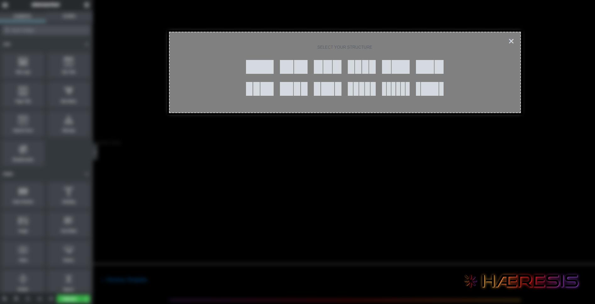
I recommend the double or triple column option, but rest assured that you can easily change the amount of columns and their width on the fly after you make whatever choice you wish at this stage. I offer these suggestions because when you look at most header structures, they fall into one of these categories. Headers are meant to be simple and easy to understand. The logo is best served on the left, while the right is best used for navigation. If you aim to keep your approach simple like this, then a two column structure is the way you want to go. Once you’ve chose the structure, all that’s left is to add a logo and navigation.
How to style a “Header” in Elementor
Now that you have chosen a structure, you’ll notice a section has been added to the top of the viewport with 2 columns sitting nice a snug within.
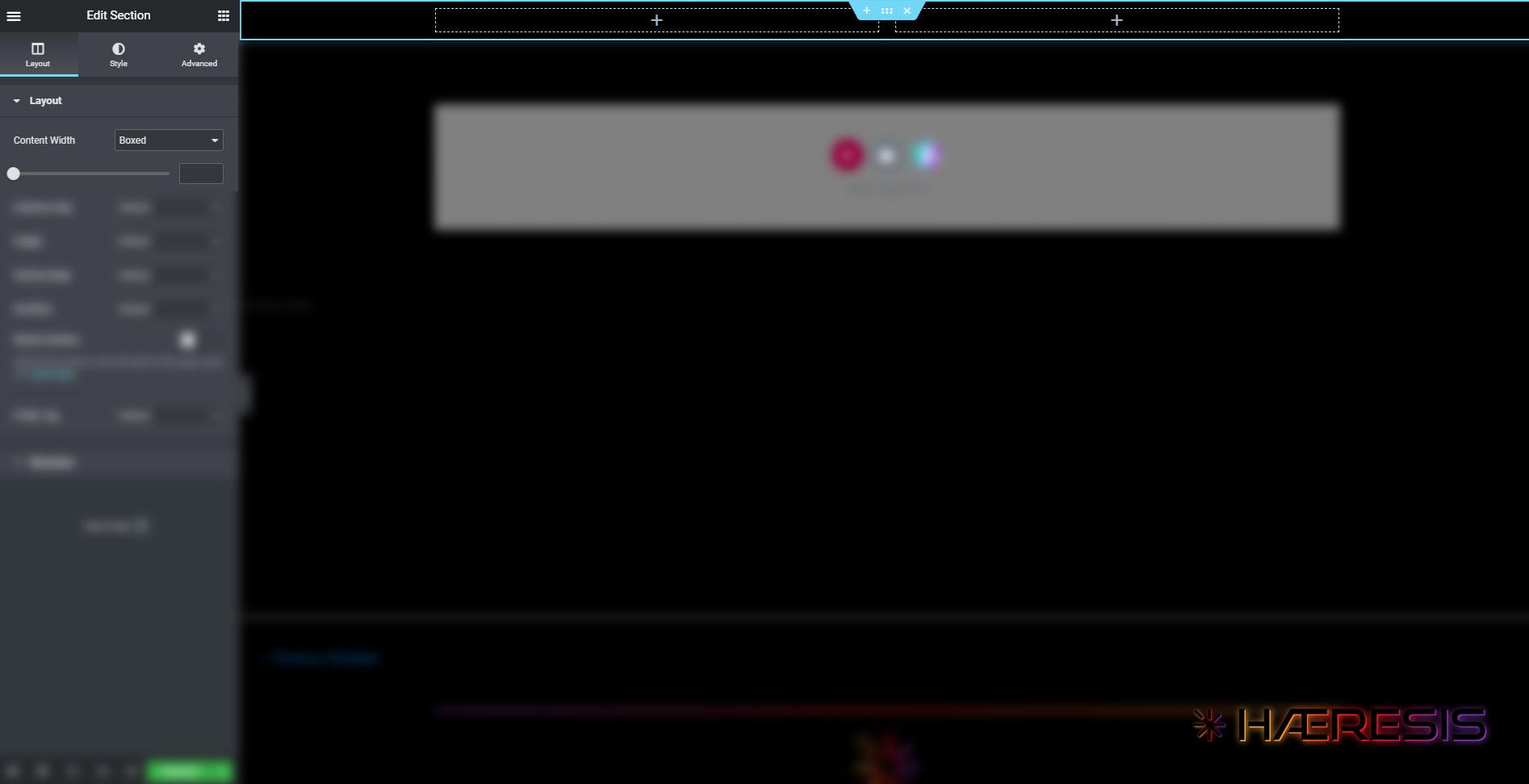
One of the first things you’ll want to do is decide if you want it to be a boxed layout or a full width layout. A boxed layout constrains the total width of all columns in a section to a specific amount of pixels. A full width layout extends the total width of the section and all columns within it to the entire width of the viewport. Both have their pros and cons, and it really is up to you as a designer to decide. You’ll find this option on the left sidebar area, which by the way, is where you’ll always find options for any element you choose to modify.
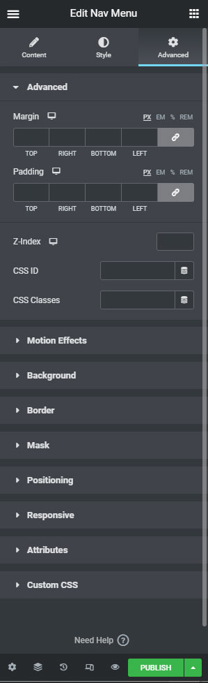
Another very important aspect you don’t want to forget about is to set your z-index for your header section to a high enough number that nothing on your page with float over it. This is only a problem if you choose to have a sticky header, which I highly recommend. You can find this option in the advanced section of the advanced tab on the left sidebar when editing the section, just under margin and padding settings.
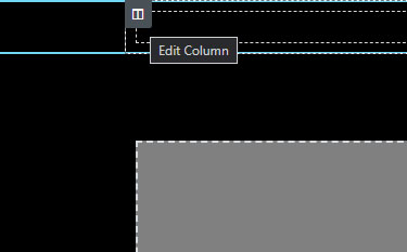
As for the columns themselves, when you hover your mouse over either one, you’ll see a gray icon show up in the top left corner of the column. Clicking it one time will select the column, and show the column specific options on the left sidebar.
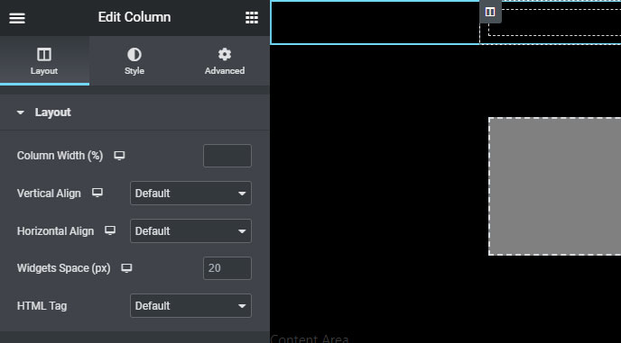
You’ll see options for width, alignment, and various others. I recommend setting vertical alignment to “middle” for both columns, at the very minimum. This will help make sure that your logo and your navigation bar are centered vertically.
Next, you’ll set column width for the left column to 20. This will automatically set the right column to 80.
Now it’s time to add the logo. You’ll turn your attention to the top right corner of the left sidebar, where you’ll see a 9-square grid icon. Clicking this will bring up all the element options for use on the page, such as headers, dividers, images, and in this case, site specific options, like site logo and nav menu. You can choose either site logo or image and drag it into the left column. I prefer to use the image option, since the site logo option is dependent on you having set the site logo in your theme elsewhere.
Simply hover your mouse over the image widget, and click and drag it into the left column. You’ll see a bright blue line show up, denoting where the widget will land if you release your mouse at that time. Once you have the line showing in the middle of the column, release your mouse and the image widget will pop into place. (Not sure why the screen capture didn’t show the widget being drug, but hopefully you get the idea.)
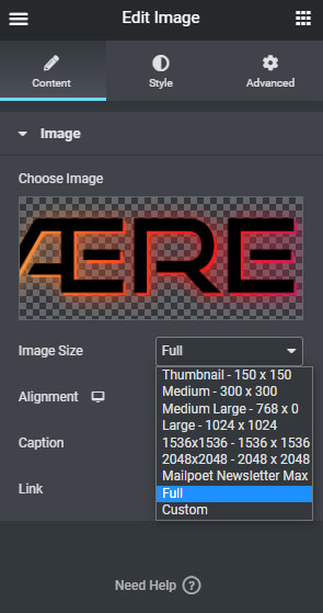
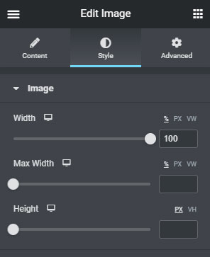
Once the image widget is in place, you see the image options show up on the right side. Your initial option will be to choose an image, which will lead you to the media library where your logo is waiting for you, or you can easily upload it. Once the image is selected and added, make sure to choose the “full” image size option for best clarity, and then under the Style tab, slide your width slider all the way to the right for 100% width. Feel free to utilize the pixel or VW options if you choose to. They are all perfectly valid options.
Now, keep in mind that the 20 / 80 rule is more of a guideline, so feel free to experiment with whatever combination you want.
Finally, we’ll add our navigation. The easiest way to do this is to go back to your 9 square grid icon to bring up your various Elementor widgets, and choose the nav menu option from the Site section. You will drag and drop it into the right column just as you did the image widget into the left column. After a second or two, the widget should load with a default to whatever your earliest created menu is. If you don’t see anything, it’s likely because you haven’t created a menu yet. You can set that up easy enough by going back to your WordPress dashboard, and navigating through the left sidebar to Appearance > Menus.
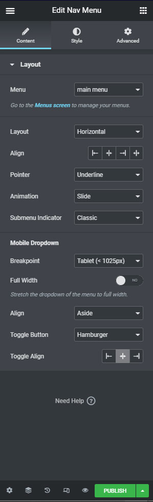
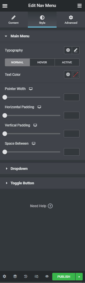
Once your nav menu is added, you can style it using the options found in the left sidebar of the Elementor page. I highly recommend exploring the options available, as it is a pretty flexible set for styling your menu, with options for alignment, pointer animation, colors, fonts and more.
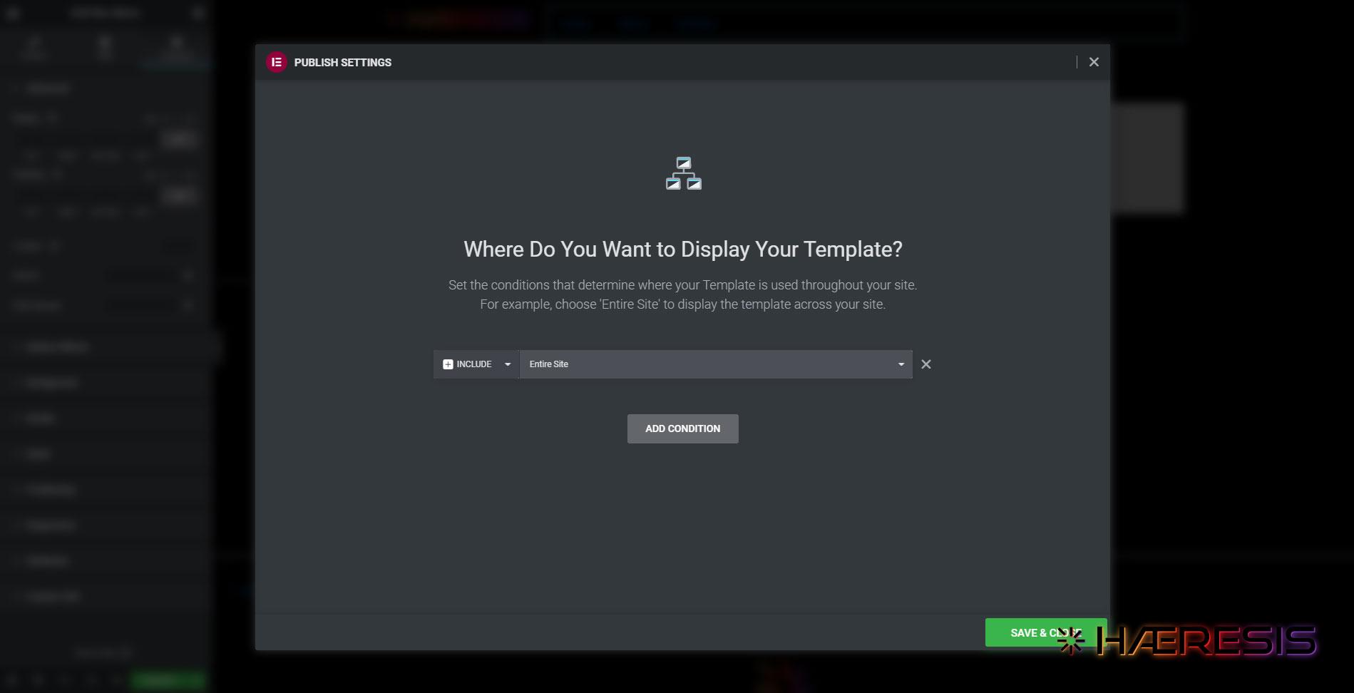
Finally, it’s time to publish the header. You’ll select Publish in the green button at the bottom of the left sidebar, and upon the first time, you’ll be presented with display options. It is this set of options that will eventually allow you to utilize multiple headers in the same site, as you may have one header for your general site, and another for landing pages. For now, we’ll focus on just setting your main header.
To do so, you’ll choose the Add Condition button in the middle of the pop up, and it will default to an “include” logic, with the “entire site” set. This basically means that it will add this particular header to every page and post for the entire site, and when you need to make changes to it, you’ll do it all from this central location using this one header template.
That, my friends, is how to create headers in elementor.
I hope you found this tutorial helpful, and please feel free to share it with anybody you think it could benefit.


