
Welcome to another episode in the How To Use Elementor series. In the first of this series, I helped explain how to create and style a header. This time I’m going to briefly go over how to add a simple fading background opacity to your header, and why you would even want to at all. Let’s get to it.
What Is Fading Header Opacity?
A fading header opacity is a simple technique whereby a bit of CSS code is used to increase the opacity, or transparency, of the background of a header on a website. On page load, the header sits atop the page, with a completely transparent background, so that all you see is the logo and the navigation floating above, hopefully, some beautiful imagery. We see examples of this in most modern web designs, including on this site. As you scroll down the page, perusing through the content, the header, made to be sticky to the top, follows along and as it does, the background of the header slowly fades into view, allowing the logo and navigation to exist in place, easy to access, while also making sure that it is visually separated enough that it doesn’t get lost in the content or imagery of the page.

What Is Needed To Set Up Fading Header Opacity In Elementor
This technique assumes that you have a header that sticks to the top of the viewport and follows along with you as you scroll down the page. If the header is not sticky, there is no point in using this technique at all. Assuming you followed along from our previous tutorial, you will want to navigate to the Advanced tab of the section that the columns of your header sit in. This is the overall blue outline that encompasses the columns that hold your logo and navigation.
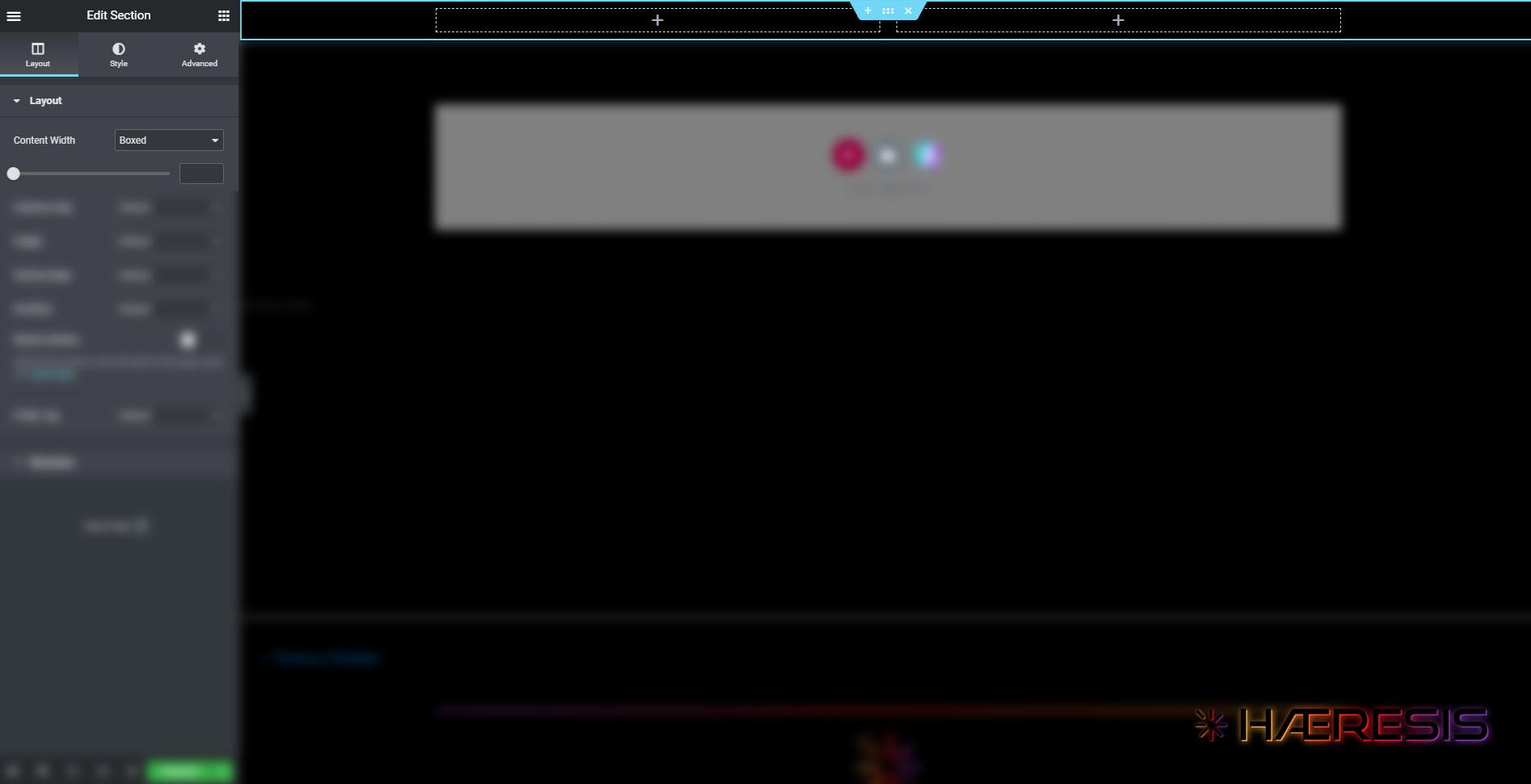
With the section selected, and confirmed via the left sidebar saying Edit Section at the top, navigate to the Advanced tab on the right. The second section, just under the Advance section, is Motion Effects. Expand that section and you will find various options, including sticky location, device enabling, and offset options.
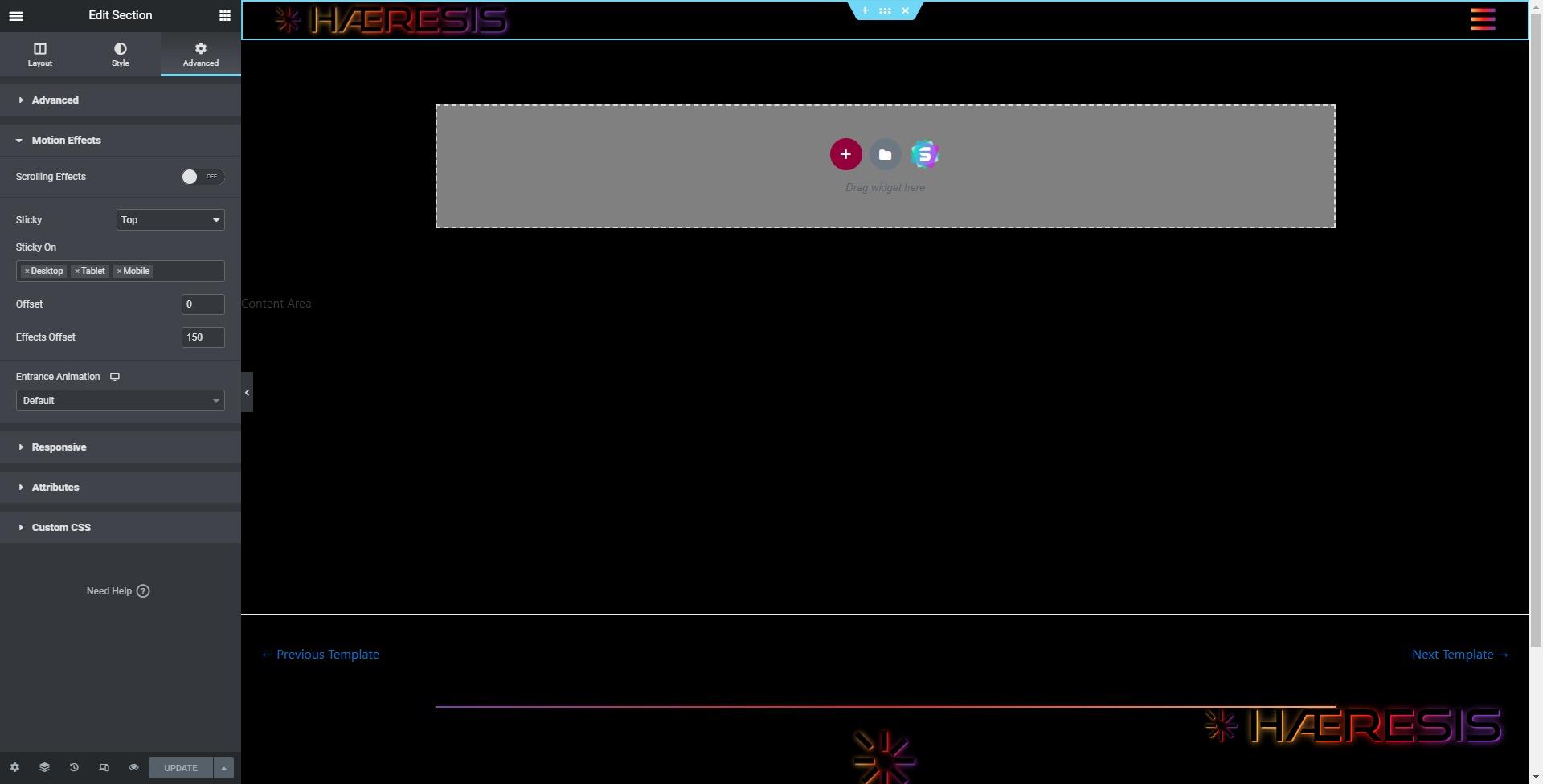
As you can see in my example, I have the sticky location set to top, enabled for all device types, offset set to 0, and Effects Offset set to 150. Basically speaking, this tells Elementor to make my header section stick to the top of the viewport, make it do so for desktop, tablet and mobile, provide no offset for the section itself, but do wait for 150 pixels of scrolling to occur before enabling any effects.
Please understand that these specific settings are tailored to work for my setup. You may need to tweak these numbers a bit to cater to your liking.
CSS Code Used For Adding Fading Header Opacity
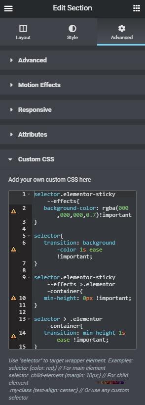
selector.elementor-sticky--effects{
   background-color: rgba(000,000,000,0.7)!important
}

selector{
   transition: background-color 1s ease !important;
}

selector.elementor-sticky--effects >.elementor-container{
   min-height: 80px !important;
}

selector > .elementor-container{
   transition: min-height 1s ease !important;
}
The code you see above is the code I use to enable a 70% transparent background to my header as users scroll down any given page. Let’s breakdown each line so you have a good understanding of what is happening.
The Background Color
selector.elementor-sticky--effects{
   background-color: rgba(000,000,000,0.7)!important
}
Hopefully you have a modicum of understanding how CSS is written. If not, I cannot recommend enough that you take a look at w3schools CSS tutorials. CSS is very intuitive and easy to pick up. It is also 100% necessary to creating top notch websites, so I would highly suggest you not skimp on becoming as familiar as you can with it. It’ll pay dividends for the rest of your career, trust me. Anywho…
In the above example, the first bit, beginning with selector. , is basically targeting the effects of the header section that we made sticky in the above step. The bits in between the { } brackets tell the section what type of style to have; in this case, a particular background color of black at 70% opacity. The color and opacity is set in rgba format (or Red, Blue Green, Alpha). For instance, if you wanted a white background instead of black, you would change the (000,000,000,.7) to (255,255,255,.7). You can find helpful tools online to help identify any color you can think of and translate it into whatever format you wish. Hex color codes also support transparency as well, but for this example, we’ll stick with rgba.
The Background Color Animation Timing
selector{
   transition: background-color 1s ease !important;
}
CSS is capable of animation and has been for a while. The code you see above is a simple shorthand for the transition attribute. It basically targets a style, in this case, the background color we defined above, and then sets timing (1s = 1 second), the interpolation (ease) and then just to be sure, a quick !important tag to make sure it is given upmost hierarchy in case there are any conflicting styles along these same lines.
Section Height
selector.elementor-sticky--effects >.elementor-container{
   min-height: 80px !important;
}
This bit of the code, in a similar way to the first bit, targets the section that houses our header structure, but goes one step deeper to target the container, the actual blue outlined section, that the header is made of. This bit of code is telling the section that it cannot be any less that 80px in height, and the !important tag at the end is to make sure it has top priority in regards to hierarchy for any conflicting styles. Depending on the size of your header and the elements you’ve placed within it, you may very well need to tweak this value to be a bit larger.
Section Height Animation Timing
selector > .elementor-container{
   transition: min-height 1s ease !important;
}
Much like the second line of code we covered above, this last bit of code dictates the timing of the transition for the minimum height as defined in the previous line of code, which is 80px. I generally have not needed to tweak this bit of code, other than to make sure that whatever seconds are allotted here match up with the seconds allotted in the animation timing for the background color. That’s not to say you can’t experiment with the timing and come up with something cool and unique.
Where To Place The Code
Finally, you’ll need to take this code and put it somewhere. Elementor makes it very easy to add custom CSS code to most any section or widget. In this case, you will navigate to the Advanced tab of the Edit Section left sidebar, and find the Custom CSS section at the bottom of the Advanced tab. There you can copy and paste this code in it’s entirety, save it, and tweak it to your liking.
That, my friends, is how you can add a simple fading opacity background to your Elementor header. I hope you found this helpful, and please feel free to share it with anybody you think it could benefit.


